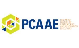
 More than 6 years into its existence, PCAAE have decided to have a new brand identity to bring the organization to phase two of its “change catalyst” advocacy and to energize its members and the association community as a whole. With this, a new logo was unveiled during the Associations Summit 7 (AS7) held on November 27-28, 2019 at the Philippine International Convention Center (PICC) (please see separate story).
The new logo is a graphic representation of the phrase, “the whole is greater than the sum of its parts.” The symbolism is likened to a kaleidoscope encapsulating many parts to create a holistic image and provide a new perspective in association governance and management.
The closed hexagonal shape embodies the six core values of PCAAE as the pillars of the organisation. These core values guide PCAAE in designing its strategic direction and brand-building initiatives. Under its new identity, PCAAE promises to usher new possibilities and approaches in providing solutions to association management and governance to benefit its members and partners.
The coming together of the strengths as symbolised by the different shapes inside the hexagon represent the community of associations. The lines and spaces that form the shapes are the connections that encourage interaction among the members in the PCAAE. This is all strengthened by the colours that make the visual symbolisms of the different advocacies of the associations in the PCAAE community – unified with shared purpose of galvanising people to ignite long-lasting positive change.
The rebranding was made possible by Chris and Janice Dingcong, the prime movers of Springtime Design Ltd. (Hong Kong).